Overview
After a decade, San Francisco Travel was ready to refresh a stale brand to better represent the product and connect with audiences.
In this brand refresh, I managed our external agency in their work on developing the branding strategy and visual identity. This meant helping to draft then communicate the vision and goals of the refresh, connecting them to relevant data and resources, as well as giving and coordinating feedback.
Additionally, I made decisions, backed by leadership, on critical components of the new visual identity, including colors, typography, and overall look-and-feel.
Finally, I led the effort to implement the new brand. That meant working across all departments to audit existing materials and determine priorities and a timeline for rolling out the new brand. Then, working with input from other stakeholders, I developed the brand guidelines and made them easily accessible for staff and creative partners.
I was proud of the work the team did to develop and launch this great brand refresh and I earned a promotion for my contributions.
Background
San Francisco Travel Association held a brand visual identity that was a decade old and, upon review after my joining the team, it didn’t quite reflect what we believed San Francisco represented. The wordmark was clumsy and featured an old-fashioned typeface, the colors were too limiting, the overall look-and-feel felt flat.
Goal
We wanted to develop a refreshed brand identity that reflected the vibrancy, culture, and optimism of San Francisco that would be flexible and scalable enough to grow with the organization for years to come.
Challenges
Before we could redevelop our branding strategy, we needed data to form the requisite insights. What we had initially was dated and incomplete, so we turned to a marketing research firm for help. That gave us guidance and reference points throughout the project.
The design challenge was then developing a new visual identity that aligned with business goals and data and felt representative of the updated brand. It had to feel modern, dynamic, and bold.
Solution
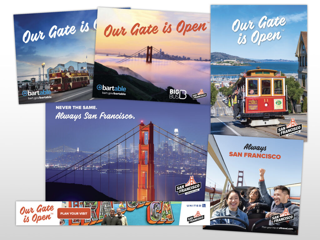
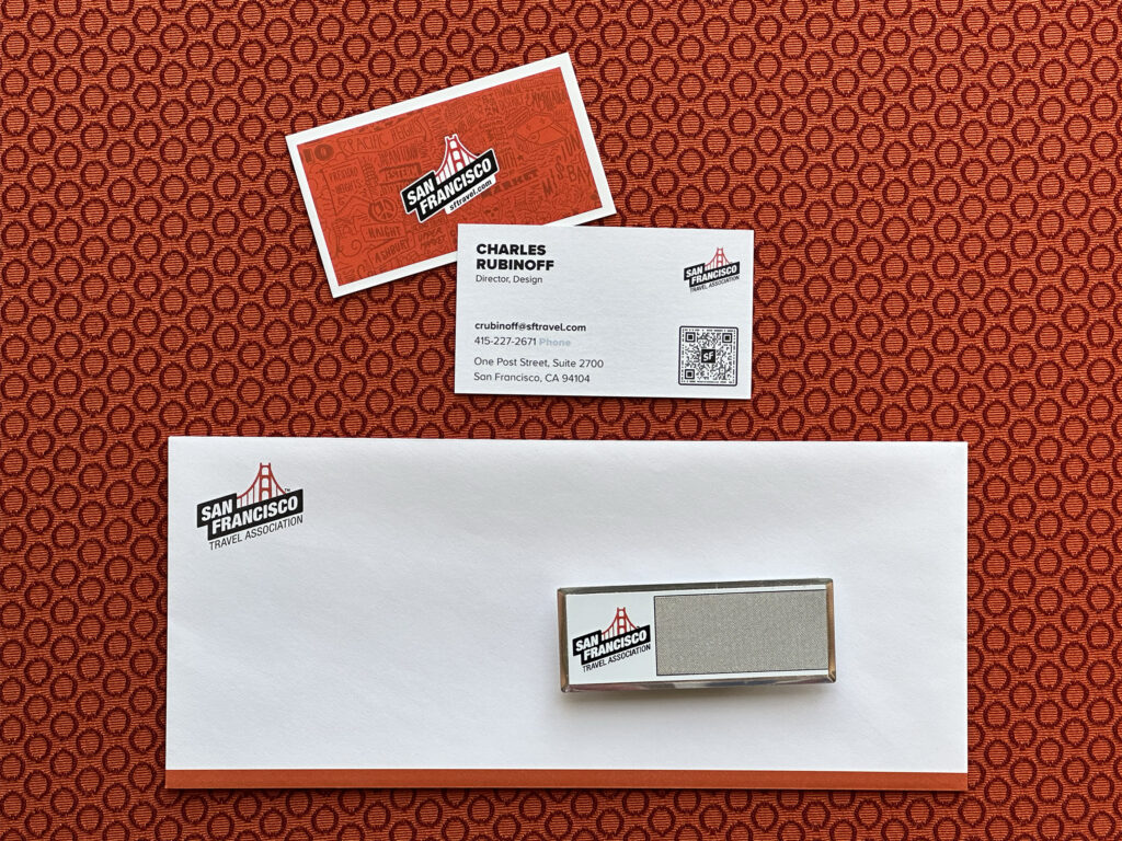
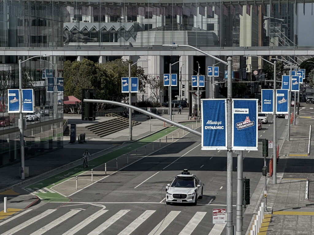
With current and comprehensive data on what our audience felt about San Francisco, we redeveloped our branding strategy with a new mission, positioning statement, and values. These weren’t wild departures from what we had previously, but there were refined. We then chose a direction for the logo and visual identity that aligned with this updated brand.
The colors, of course, featured our International Orange as well as prominent secondary colors found through the City by the Bay, including a Fog Blue and Cabernet dark red. The typography features a modern sans-serif and an accent accompaniment to touch on the playful side of the city’s character.
Impact
The brand refresh was met with lavish praise and has remained a flexible platform supporting external campaigns, internal communications, and the overall visual identity of San Francisco’s destination marketing organization. While it’s certainly evolved over the years, it remains a solid brand identity that’s widely recognized and respected and carries with it the spirit of San Francisco.
Learnings
This was my first time working through an entire brand refresh. We took our time in development and implementation so as to not rush things and to do it right the first time. That’s something I’ll keep in mind for next time, but there are also opportunities to improve. We commissioned a ton of market research and there’s a point where additional data is just long tail and not worth the cost or time. We missed the mark on that a little bit. Additionally, next time, I’d re-consider using alternative characters in a brand typeface for the sake of simpler brand guidelines and better staff/agency adherence to those brand guidelines.
Brand Refresh
CLIENT
San Francisco Travel Association
ROLE
Art Direction