Overview
A dated website with poor information architecture needed a redesign. Following a brand refresh, I worked with the Miles Partnership to develop a new look for the extensive sftravel.com.
I led the agency through a review of our updated visual identity and set direction for the new website design, noting typographical/layout/image treatments I developed that should be reflected in this digital and interactive work. Our agency created a few basic templates that my team and I helped refine. After that, I led the design of subsequent new templates in-house.
Additionally, I helped lead the effort to improve accessibility on our website to meet or exceed WCAG 2.0 AA standards. Improving accessibility improves the experience for everyone.
The new website showcases our current brand identity—and San Francisco—well and the metrics show our improving engagement, year after/over year.
Background
After a decade, sftravel.com was overdue for a redesign. After a recently completed refresh of our brand—and a break due to the pandemic—we finally had the opportunity to completely redesign the website.
Goal
Besides updating the visual identity of the website, the goals of this project were to evolve the San Francisco destination brand to reflect the growing globalization and transformation of the city. This meant making our existing, and ever-expanding, content easier to find and more accessible for all.
Challenges
The business challenge was developing a whole new website that users worldwide would use to connect to the experience of San Francisco, lead to hotel bookings, increase exposure for partners, and serve as a resource for leisure and business visitors.
The design challenges were doing the above in way that featured our updated visual identity, increased engagement, and told a story about San Francisco that would inspire visitation and shares. This took a brand visual identity that has been primarily showcased through print and digital ads and expanding it into a fully responsive, complete website.
Solution
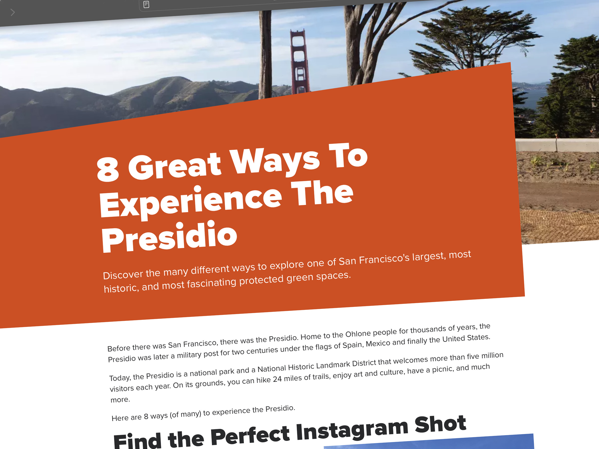
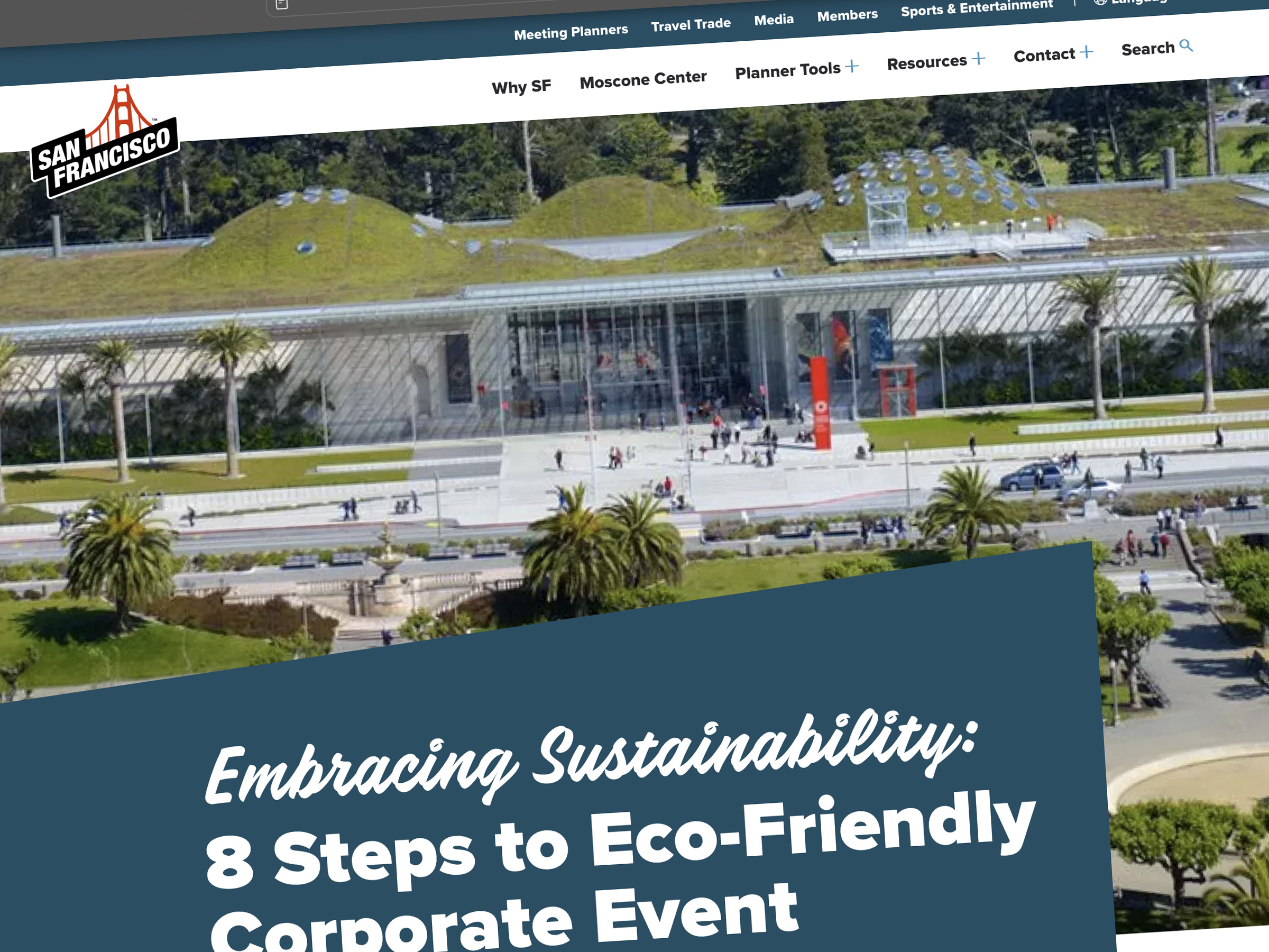
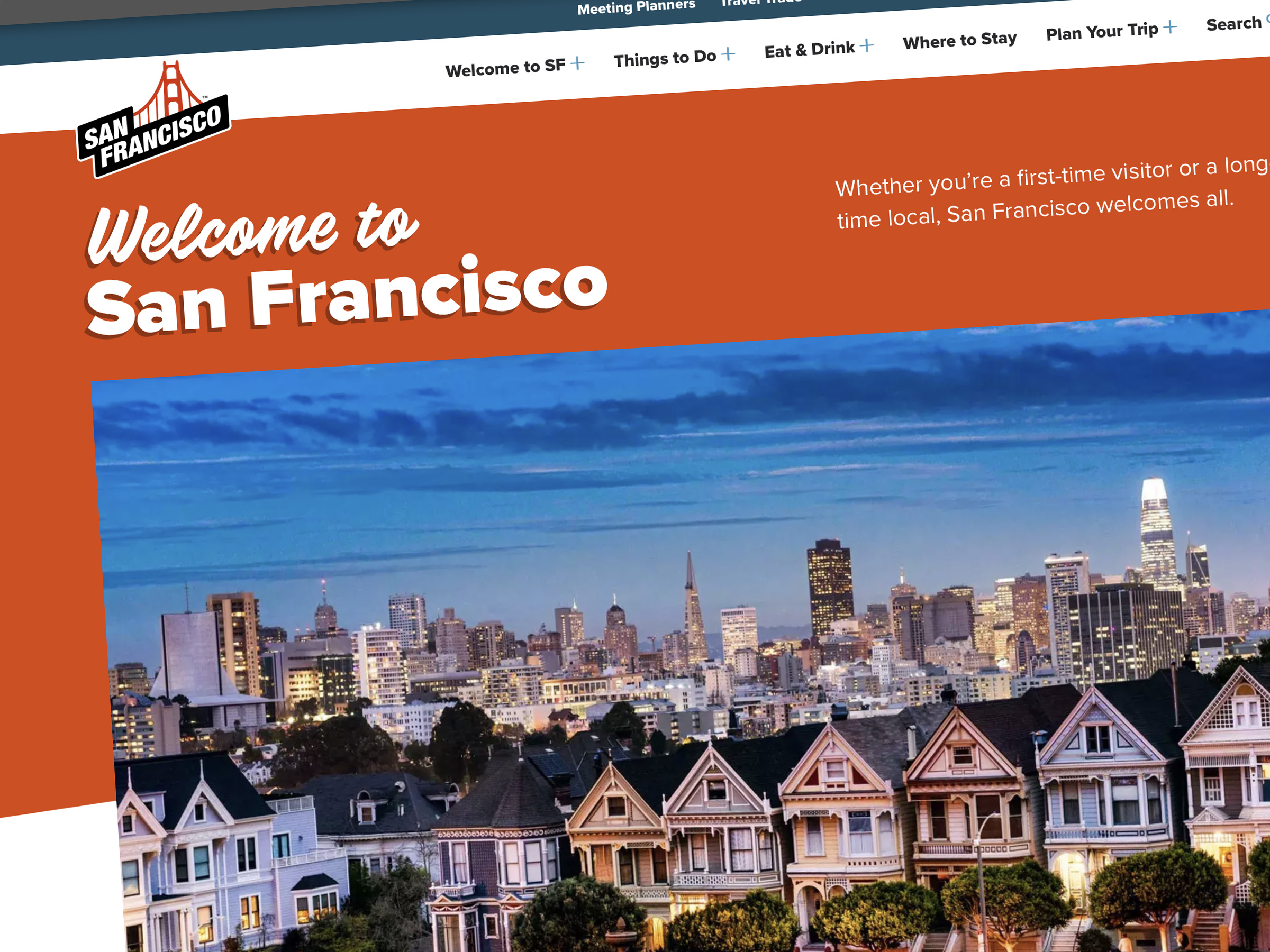
I worked with the agency to develop the new look and feel of the website in a way that incorporated design elements I had created for our brand. This meant the visitor would have a cohesive and consistent experience across brand touchpoints. This design includes angled containers that break the grid, edge-to-edge dramatic photos, and interactive elements throughout such as hover animations, carousels, tool tips, and, of course, video throughout.
Impact
The new website took off quickly and we received many positive comments. More than that, engagement metrics soon surpassed the old site YOY and have been growing even stronger since. In 2023, the website quickly won industry recognition with an Adrian Award for Digital—Website.
Learnings
This was my second major website redesign project and while it’s a sure bet things will never go quite as planned, each experience gets a bit smoother. I was fortunate to work with a great team and agency to bring this to life and am happy I could help shape the overall look and experience. The biggest changed I’d make next time relates to the content management system selected and choosing another particular one for a an easier experience in updating content and future flexibility.
sftravel.com
CLIENT
San Francisco Travel Association
ROLE
Art Direction